
A Lesson in Usability from My 4-Year-Old Son
Article Summary
- Adults use learned symbols to navigate interfaces, but children reveal that clear, direct feedback is universally better.
- Reframe user “misuse” as honest exploration; it is free usability testing that uncovers your design’s weaknesses.
- Designing for a child who needs zero instructions sharpens the initial experience for every first-time user.
One afternoon, my 4-year-old son pointed at the TV remote and asked, “How do I make it louder?”
I told him, “Just press the volume button.”
But instead of pressing it, he looked at the remote in confusion:
“What’s ‘volume’? Which one is that?”
In that moment, I realized something critical: the buttons for volume and channel were identical in shape, size, and color — distinguished only by tiny labels. To me, it was obvious. To him, completely unintelligible.

As someone who works in UX, I was humbled. I had been designing for people who already understood.
UX is about making things easy to use. But are we really designing for first-time users? For people who don’t bring assumptions or prior knowledge?
This article explores what children, especially very young ones can teach us about designing for true usability.
Why Kids Are the Most Honest Users
Children don’t interpret symbols the way adults do. They don’t infer meaning from context or recognize design conventions. Instead, they react directly to what they see, hear, or touch.
A triangle doesn’t mean “play.” A cross doesn’t mean “close.” These are learned interpretations. To a child, these are just shapes.
I once watched my son ask why arrows were on both sides of a tablet screen. When tapping them didn’t trigger a clear response, he said, “Did it break?”
This is the essence of direct manipulation, a concept from cognitive psychology that describes how we understand systems by physically interacting with them. For children, if nothing happens after they act, the system feels broken. Visual or tactile feedback is more important than labels or icons.
This doesn’t apply only to digital interfaces. If a snack package seal doesn’t clearly show how to open it, the design has failed, no matter how many arrows or instructions you print.
What Children Teach Us About UX Foundations
■ Intuition: Learning through touch
For kids, UX boils down to one question: Can I figure this out just by trying it? If there’s no visual cue, no feedback, and no hint of interactivity, the interaction fails.
One day, I watched my son interact with a children’s picture book app. He traced his finger across the screen, and characters reacted with sound and animation. No tutorials. No frustration. Just exploration. That moment felt like UX at its purest.
■ Discovery: When “Misuse” Is Just Honest Exploration
Children don’t follow the “right” way to use something. They press, swipe, or tap wherever they feel like. Designers might see this as misuse, but it’s actually free usability testing.
A child who mashes the voice assistant icon 10 times isn’t being difficult. They’re stress-testing your interaction design.
Instead of labeling their behavior as “wrong,” ask:
What were they trying to do?
Did the interface support their curiosity or shut it down?
Moments like these reveal whether your UI can flex or break — whether it invites interaction, or punishes deviation.
■ Emotion and Feedback: Responding in Real Time
Children respond to what they can see or hear. If something glows, chimes, or moves, they know it worked. If not, they assume it failed.
This aligns perfectly with Don Norman’s core UX principles: visibility and feedback.
These are not “kid-only” needs. Adults disengage too, they’re just more polite about it. Whether it’s a button, a toggle, or a touchscreen toy, the fastest way to build trust is to respond clearly, instantly, and predictably.
Usability isn’t just about working well — it’s about feeling responsive and reliable.
■ Designing for Children Sharpens Design for All
Up to this point, we’ve looked at how observing children can highlight usability issues that often go unnoticed. Children’s reactions serve as a mirror, they reflect the raw surface of our design before layers of learned behavior smooth over the flaws.
But does UX for children really differ that much from UX for adults? Yes and no.
In her book “Design for Kids: Digital Products for Playing and Learning” (Debra Levin Gelman, 2014), the author breaks this down into differences and similarities that are worth revisiting for any designer.
Key Differences in UX for Children
Children are highly responsive to what’s happening right now. If they don’t understand, enjoy, or feel engaged in the moment, they’ll drop off quickly. This means that UX for kids needs to deliver:
| Aspect | Key Considerations in UX Design for Children |
| Motivation & Friction | Encourage continued interaction by enabling a sense of achievement through small, repeatable successes. |
| Feedback | Provide immediate and clear responses (e.g., sound or animation) to reinforce actions. Children expect rewards for each interaction. |
| Trustfulness | Children take UI behavior and character actions at face value. Design should ensure emotional and physical safety. |
| Shifting Attention | Children’s focus shifts quickly — structures should be short and engaging. Also consider age-specific cognitive stages (e.g., in 2-year increments). |
They’re not going to persist through unclear instructions or ambiguous icons — they’ll simply leave or try something else.
Shared Principles Across All Age Groups
Interestingly, the same book outlines four UX principles that apply equally to children and adults:
| Principle | Universal Importance in UX Design |
| Consistency | Users can confidently explore and learn when operations and visual expressions are predictable and uniform. 。 |
| Clarity of Purpose | It’s clear to the user why an action is needed and what it will achieve. |
| No Unnecessary Surprises | Avoiding unexpected behavior builds trust and prevents confusion or hesitation. |
| Delightful Bonuses | Small moments of joy or satisfaction encourage continued use and enhance overall user experience. |
These principles mirror what we often refer to in Human-Centered Design (HCD). In other words, designing for kids can sharpen our thinking about what makes an experience intuitive and satisfying for any user.
Rethinking UX Through the Eyes of a Child
Rethinking UX through a child’s eyes isn’t just about designing for kids, it’s about recognizing that many users, regardless of age, interact with technology without prior instruction or training. From elderly users to first-time visitors to your app, most people simply want to get started and figure things out as they go.
The design principles that benefit children, such as immediate feedback and visually clear guidance, are in fact, also crucial for many other users. Those with visual or auditory impairments, or users who struggle with dense text, similarly rely on interfaces that are intuitive and easy to navigate. In this way, a UX that is gentle and intuitive for children can also reduce friction for everyone.
This approach reflects the core of inclusive and universal design, not just accommodating edge cases, but crafting experiences that reduce friction for everyone. When we build for outliers like children or seniors, we often uncover improvements that benefit all users.
Consider a familiar scenario: you’re trying to make a bank transfer at an ATM, but you accidentally press “Back” instead of “Confirm” and have to start over. It’s a common frustration. I’ve experienced it myself. This highlights how even everyday interfaces can fail users not by being overly complex, but by lacking clear cues, predictable flow, or recovery options when things go wrong.

UX failures don’t always stem from complexity. More often, they come from users being unable to figure out how to begin — not knowing what to do first or where to focus their attention. In other words, the intuitiveness of the initial interaction can make or break the user experience.
The insights we gain from observing children offer direct clues for designing interfaces that are understandable, accessible, and welcoming to all. These aren’t just lessons for designing “for kids.” They represent the starting point of truly human-centered design, one that fits the needs of everyone, not just a specific demographic.
Rethinking UX with a Child’s Curiosity
■ Re-evaluating the Value of Behavioral Observation
There are insights you simply can’t get from interviews or surveys, they emerge when you watch users in action. Children, especially, don’t operate under the assumption that they should “read first, then interact.” They dive in and start touching things. Their behavior offers an unfiltered glimpse into how a product is actually being understood, explored, and used. This isn’t unique to children. The same principle holds true for adult users: real usage reveals real issues.
■ Learning from “Misuse” and Unexpected Behavior
Children rarely use products the way designers intend. They mash buttons, swipe in random directions, or tap endlessly on unlabelled elements. Rather than viewing these actions as user errors, treat them as indicators of confusion or ambiguity in the design.
In UX practice, unexpected behaviors observed during usability tests shouldn’t be dismissed as noise, they are often powerful cues for where to refine interaction models. Reframing “error” as “user feedback” is a step toward making more intuitive and robust designs.
This shift in mindset — from blaming the user to questioning the interface — is where true UX improvement begins.
■ Use “Can They Use It Without Help?” as a Litmus Test
Children don’t read manuals or follow instructions. So the key test becomes: Can they figure out how to use it just by looking and touching?
In fact, many SaaS and web-based services live or die by their first session. If users can’t accomplish their goal in the first few minutes, they may never return. Children who engage with no mental model or onboarding memory, offer a raw look at where first-time UX breaks down.
Watching how a child explores something for the very first time is a simple and powerful way to evaluate the intuitive quality of your interface. A product that works without explanation—one that invites interaction through clear cues—often leads to higher retention and satisfaction.
That first step — hesitant or confident — often points directly to where the onboarding journey needs refinement.
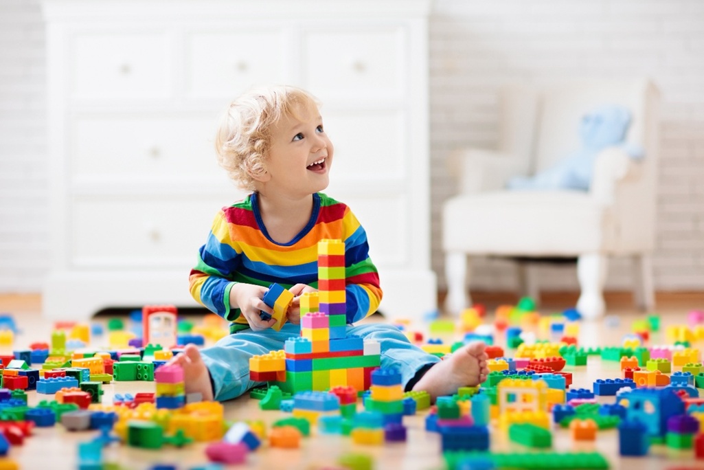
■ Case Study 1: LEGO’s Icon-Based Instructions
LEGO’s manuals work in every language because they use none. Arrows, colors, and visuals guide children (and adults) through complex assemblies, one intuitive step at a time.
This is visual usability at its finest.
■ Case Study 2: Nintendo’s Gentle Onboarding and Accessible Language
Nintendo’s philosophy is simple: if a game needs a manual, it has already failed.
Games like Super Mario teach players everything they need to know in the first few seconds. You jump, collect, avoid, retry—all without ever reading a word. Their use of phonetic guides (furigana) and plain language also makes games accessible to children, elders, and non-native readers.
This is inclusive UX done right.
Conclusion: Returning to UX Fundamentals
Children remind us of what good UX really means.
Designs that don’t need explaining.
Interfaces that invite interaction.
Experiences that feel safe and satisfying from the very first tap.
So next time a user struggles with your product, ask yourself: Could a child figure this out?
Because what works for them might just be what everyone needs.
At Uism, we specialize in intuitive UX, rooted in behavioral observation and first-use clarity. From digital platforms to medical devices, we help design experiences that work, even without instructions.
Let’s build things people just “get.”
References:
Books:
- The Nintendo Equation of Surprise (NHK Publishing, Akihiro Nakamura)
- Designing for Kids by Debra Levin Gelman (BNN Publishing)
Related Article: