In the busy departure lobby of Narita Airport, two Korean men paused at a vending machine to grab a drink. They tapped their credit card but nothing happened. They tried again, but still no luck. As they noticed the line forming behind them, they gave it one last shot, only to step aside, empty-handed and visibly puzzled.
For many international travelers, Japan’s vending machines are an iconic part of the experience. They’re seemingly everywhere, offering pretty much anything. Today, many of these have a cashless payment option installed, providing increased convenience. But what seems straightforward to locals can be baffling for newcomers. While waiting for my flight, I spent 90 minutes watching foreign visitors navigate one of these machines, hoping to get a better picture of some of the UX hurdles they face in Japan’s growing cashless landscape.
The Vending Machine in Focus
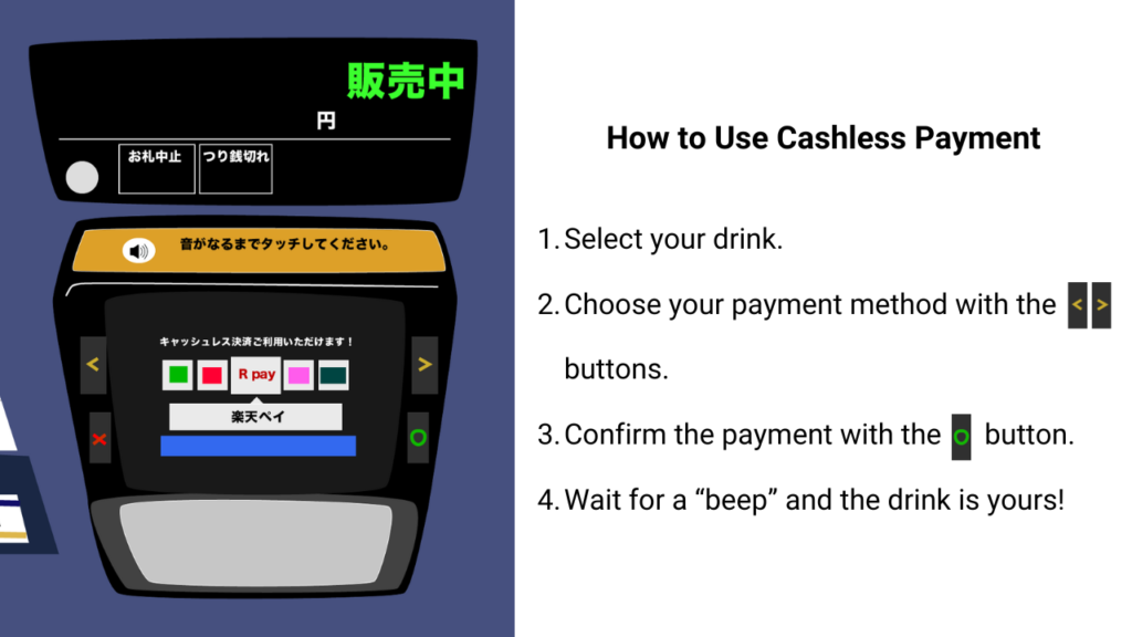
The vending machine I observed had various options for payment: cash, credit cards, IC transportation cards, and QR code payment. The intended process seemed simple enough:

Method: Naturalistic Observation
Using naturalistic observation (a method often used in psychology and UX research to observe behavior in real-world settings), I decided to see how travelers from different backgrounds interacted with the machine. Narita Airport, where you have travelers from every corner of the world, felt like the perfect spot to observe how well the machine’s UX held up.
- Location: Narita Airport departure lobby
- Observation Duration: 90 minutes
- Approximate Number of Users Observed: 200
Key UX Issues and User Reactions
During the 90 minutes, I noticed many international users trying cashless payments, and a surprising number ran into issues. Here are the main UX problems that surfaced, along with the common behaviors that followed.
UX Challenges
- Unclear payment steps
After choosing a payment method, users need to press a confirmation button, but this wasn’t very obvious. Many users tapped their card several times without hitting the button, leading to repeated failures. To complicate things further, if they took too long, the screen reset without warning, which some didn’t notice as their card was blocking the screen. - Mistaken for touchscreen
The display looks a lot like a touchscreen, but you actually have to use physical buttons to operate it, which threw off many users who instinctively tried tapping the screen. - Unclear card compatibility
Some international cards didn’t work, but the machine didn’t provide a reason why or suggest alternative methods, which led to frustration and confusion. - Vague English labels
Drink options were only labeled with broad categories like “Water” or “Tea,” making it difficult for users to know exactly what they were choosing.
User Reactions
Users adapted to these challenges in different ways. Most tried cashless options two to three times before giving up, but some determined users went at it five times or more before switching to cash. Here are some observed patterns:
- Tries multiple times and succeed (Average attempts: 2-3)
- Tries multiple times and give up (Average attempts: 2-3)
- Line up again to observe how others purchase
- Asking for help from people behind them in line
- Switching to cash (After 2-3 cashless attempts)
- Using a translation app
Potential Improvements
Based on these observations, here are some UX suggestions that could make things easier for international users:
- Clearer payment steps
Add visual cues like an on-screen prompt to remind users to press the confirmation button after choosing a payment method. A countdown timer would also help by alerting users before the screen resets. - Emphasize button use over touch
Since it looks like a touchscreen, it would help to highlight that buttons control the machine, with clearer labeling or symbols indicating “Use Buttons to Operate.” - Alternative options for unaccepted cards
When an international card doesn’t work, it should display an option to use cash or another payment method, giving the user a clear alternative. - More specific English labels
Labels like “Sparkling Water” or “Green Tea” would make it easier for users to know what they’re selecting without the guesswork.
Conclusion
Japan’s vending machines are an everyday fixture, but they could be more foreigner-friendly. In multicultural spaces like airports, UX improvements that cater to international users would make these machines more welcoming. The vending machine I observed was designed for Japanese users, with English labels added almost as an afterthought. A design overhaul that considers a broader audience could help leave a positive impression on visitors, making for a smoother experience and a memorable part of their trip to Japan.
We at Uism are passionate about everyday UX, driven by a curiosity to see the world from new perspectives as we pursue our research. If you’re considering UX research for your product, please feel free to reach out!


