Empty space, leaving things out, can speak more strongly than putting them in, and I think that’s very Japanese.
— Hiroe Swen (Ceramic Artist)
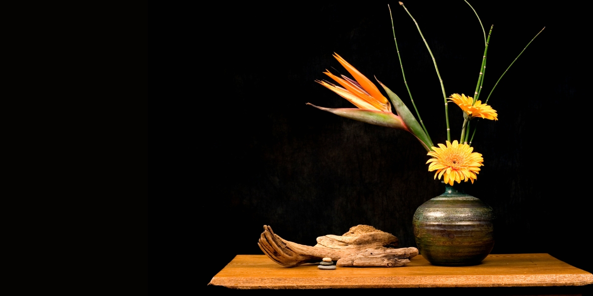
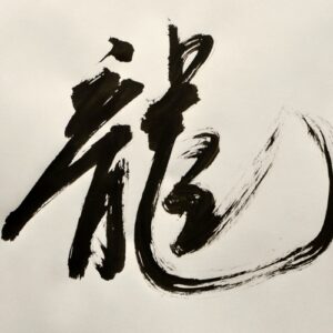
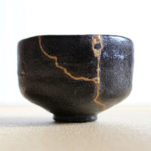
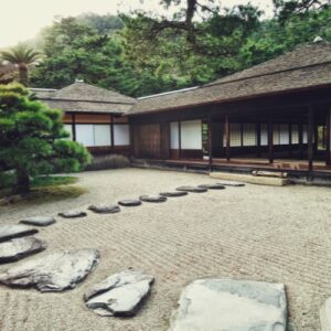
Ma (間), meaning gap, pause, or space, is a spiritual concept of emptiness deeply rooted in Japanese art and culture. It represents the beauty found in the space between things and the gaps that we often overlook have deep meaning. This principle can be seen in various art such as Japanese gardens, calligraphy, and pottery, where intentional emptiness enhances the overall aesthetic.
Yet, when we turn to Japanese web design, we often see something entirely different. Many websites are filled with dense information, small fonts, and packed visuals, seemingly ignoring the essence of Ma. This is largely influenced by Japan’s cultural preference for reassurance: a tendency to provide as much information as possible to ensure users feel fully informed. While this approach may appear cluttered by global standards, it aligns with a psychological need for security and detail-oriented communication in Japan.
Here are some examples of Japanese web design:
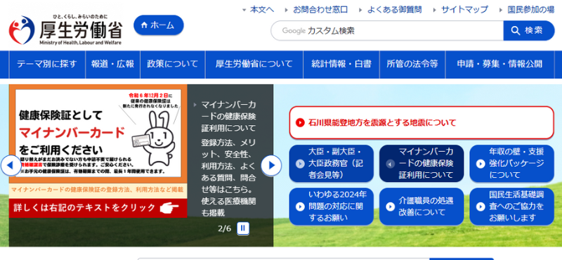
- Government
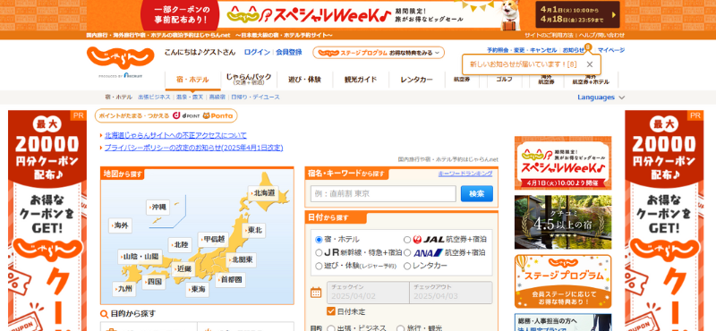
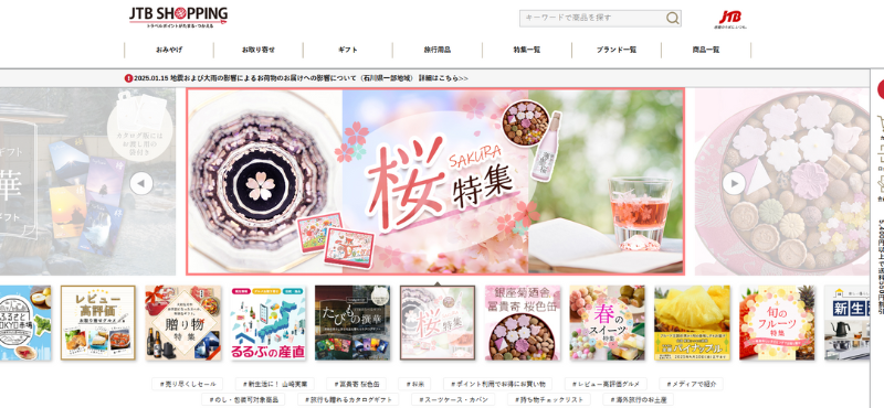
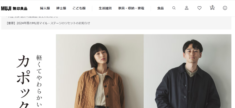
- EC site
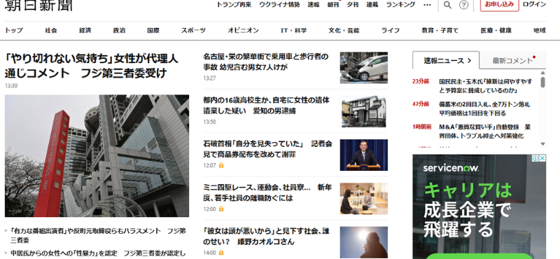
- News
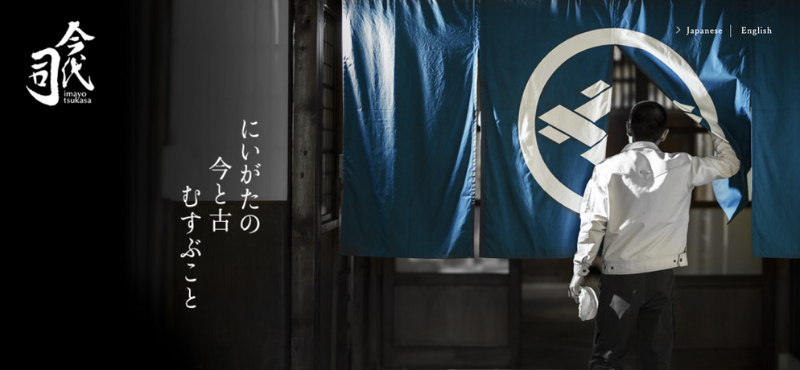
Granted, not all Japanese web design follow this approach. In industries where emotional impact, elegance, or storytelling are essential, we see a more minimalistic aesthetic, embracing Ma through balanced spacing and muted visual elements.
Interestingly, when researching Ma in UX design, most studies come from foreign perspectives, with little exploration from Japan itself. This may suggest that Ma in digital design is often an ingrained intuition rather than a consciously applied principle. As a Japanese individual, I’m curious to explore the nuances within Japanese web design, which brings me to a question I find worth exploring:
We’ll break it down by looking at:
Characteristics of Ma in web design
How Ma plays a role across industries
Let’s dive in!
Characteristics of Ma in web design
Through an analysis of various Japanese websites, I identified key recurring design elements that reflect Ma.
1. Whitespace-to-Content Balance
The most striking aspect of Ma in digital design is its use of whitespace. Websites that embrace Ma feature generous margins and open spaces between text and images, allowing content to breathe and guiding the user’s focus.
2. Slow-Paced, Subtle Motion
Ma-inspired websites favor subtle movements, such as soft fade-ins. These gentle transitions create a sense of calmness in the UX.
3. Muted Colors
Instead of vibrant, saturated colors, websites incorporating Ma utilize neutral tones, soft gradients, and natural textures, reducing visual distractions.
4. Typography (Letter Spacing & Vertical Writing)
Typography is perhaps one of the most distinctive aspects of Japanese design. Comprising Kanji, Hiragana, and Katakana, Japanese characters offer infinite possibilities for alignment and presentation, allowing for creative expression unique to Japan. The font effects, vertical text placement, and deliberate letter spacing all contribute to the rhythm and balance of Ma in web design. Asymmetry further enhances typography as a powerful design tool, where the flow of text is just as important as the words themselves.
How Ma plays a role in web design across industries
While Ma is not present in all Japanese web design, it plays a crucial role in certain industries. Below is a subjective analysis of where Ma is more commonly found and how it influences each category.
| Category | How Ma Plays a Role | Example Websites |
| High-end Fashion, Beauty, Hospitality | Enhances exclusivity, storytelling, elegance, and luxury. | Luxury brands Hotels Michelin-star restaurants Salons |
| Traditional Craftsmanship & Cultural Heritage | Emphasizes heritage and authenticity | Japanese confectionaries Kimono stores Japanese gardens |
| Minimalist & Lifestyle Brands | Reinforces simplicity and practicality. | Minimalistic fashion brands Furniture brands |
| Portfolio & Personal Branding | Creates a clean, visually impactful portfolio, highlighting individual work. | Independent designers Photographers Writers |
| Health & Wellness | Creates a sense of calm. | Yoga studios Organic brands |
The effectiveness of Ma depends on the website’s purpose and the message it aims to convey. Some brands benefit from Ma because it enhances emotional or visual impact, while others require high-density content or fast interactions, making Ma less suitable. For brands focused on exclusivity, storytelling, and identity, Ma is highly effective. However, for informational websites such as news, government, or EC sites where users expect dense content for quick access and reassurance, Ma can have a reverse effect making the site feel unreliable. Therefore, Ma should align with the website’s intent and user needs rather than being treated as a one-size-fits-all approach.
Conclusion
This brings us back to the central question:
What defines a successful use of Ma in digital design in Japan?
The answer lies in alignment. Balancing aesthetics, usability, and user expectations. When used effectively, Ma enhances storytelling and engagement, creating a visually compelling and emotionally resonant experience. However, in contexts where users prioritize efficiency, a more structured, information-dense layout may be the better choice.
Key Takeaways:
- Ma in digital design is not just about empty space. It’s about balance and rhythm in how content is presented.
- Japanese digital aesthetics vary by industry: Luxury and lifestyle brands embrace Ma, while government, news, and EC sites prioritize information density.
- A minimalist design does not automatically mean better UX. Localization and cultural adaptation are critical to ensuring usability in Japan.
What’s Next?
At Uism, we dive deep into UX research that’s tailored to Japan’s unique digital culture. Whether you’re launching something new, localizing a global site, or refining your UI for better engagement, understanding cultural nuances like Ma makes a difference.
What works in other markets might not always land in Japan (vice versa). Through user testing, localization research, and prototype evaluations, we help companies create digital experiences that feel intuitive and natural to Japanese users. If you’re looking to enhance your UX strategy for Japan, let’s connect!
