Japan has a long history of taking ideas from other cultures and refining them into something uniquely Japanese. Toilets are no exception. They’ve been transformed into high-tech marvels, complete with heated seats, bidets, dryers, self-cleaning functions, sound masking, all integrated into a compact Washlet.
But here’s the twist. For something so advanced, there are countless websites, infographics, and tutorials explaining how to use them. Shouldn’t that raise a yellow flag? If something needs that much explanation, can it really be called user-friendly?
When Icons Expect You to Just Know
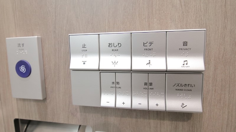
Step into any modern restroom, and you’ll likely encounter a Washlet with icons, and if you’re lucky, brief English translations. However, they can be baffling unless you already know what the feature is. Honestly, even for me. What does the music note mean? Why are there three different spray options? How do you flush; is it a button, a sensor, or a lever?
As one foreign woman living in Japan shared:
Sometimes they’re a little confusing. The flush button is in the control panel and other times it is somewhere else.
This confusion reflects a deeper issue tied to Japan’s high-context communication style. In such cultures, much is left unsaid, relying on shared knowledge and subtle cues. This mindset often carries over into physical UI design. Icons are not always designed to explain, but rather a reminder for something the user is assumed to already understand.
It’s a bit like the unspoken rules in Japanese society, where nothing is explicitly stated and no one teaches you the rules, because everyone is expected to just know. This concept is known as 暗黙の了解 (anmoku no ryōkai, or tacit understanding), and it shows up in everyday situations. For visitors or even locals from a different generation or region, this is quite disorienting.
Ironically, the clearest communication in Japanese restrooms isn’t about the Washlet at all. It’s about toilet etiquette. In touristy areas, you’ll find signs showing how not to sit on a toilet. These illustrations may not be beautiful, but they’re visual, direct, and most importantly, they work. If we can design signage that communicates toilet etiquette to a global audience so effectively, why can’t we bring that same clarity to the features themselves?
Lost in Translation
Japan has made significant strides in universal efforts in recent years. In the case of toilets, some newer models offer multilingual options, allowing users to switch between languages. It’s a step forward, but the translations are often vague or too literal to be helpful. As someone fluent in both Japanese and English, I sometimes feel the English is added more for appearance than functionality.
Icons still do most of the work, but when paired with vague translations and culturally embedded assumptions, they become little more than decorative elements, lacking the clarity or support users actually need. And when universal design fails to function, it undermines its own purpose.
The belief that icons are universal is one of the most common traps in UX design. This assumption can be misleading even in Japan where it is famous for visual communication. In theory, icons should transcend language, but in reality, they are tied to specific cultural meanings, habits, and lived experiences. This applies far beyond toilets. From vending machines and train stations to theme parks, Japan’s physical interfaces often rely on visual simplicity and implicit understanding. Without testing designs across diverse user groups, they risk serving only those already familiar with Japanese norms.
Hidden Biases Behind Icons and Everyday Design
What makes this especially tricky are the cognitive biases. Here are two that show up frequently in interface design:
- Familiarity Bias
The more we use something, the more intuitive it feels. We stop questioning what each icon means because we’ve learned it, not because it was well-designed. What once required learning now feels like common sense, and this is why locals breeze through interfaces that stump visitors. Sometimes, familiarity just masks usability issues. - Cultural Bias
Icons aren’t created in a vacuum. They reflect cultural norms, aesthetic preferences, and symbolic logic. A symbol that seems obvious in Japan might carry a completely different interpretation elsewhere. Without international user testing, these assumptions go unchecked.
The Bigger Picture
Japanese toilets are remarkable examples of design and innovation, yet some of their brilliance can be lost in translation. The interfaces assume that users already understand the features, the icons, and the mindset behind them.
That’s the takeaway:
The problem is not the technology.
It’s how we communicate it.
When something is seen as common sense locally, we tend to overlook how confusing it may be for others. Especially when a product crosses cultural borders, true universality requires stepping outside your own perspective and asking, “Would this make sense to someone seeing it for the first time?”
As a researcher and as part of the team at Uism working across global contexts, I try to stay aware of these silent complexities. What feels natural in one culture may be an enigma in another. That’s why we believe meaningful UX research begins by questioning what is often taken for granted and reimagining it through the lens of diverse users. Even something as ordinary as a toilet can reveal how culture, design, and communication intertwine, and that is why UX research matters more than ever.
At Uism, we apply a range of research methods from usability testing and A/B testing to ethnographic studies and large-scale surveys. Whether you’re exploring how your interface performs across cultures or testing the effectiveness of new icons, we tailor our approach to uncover the nuances that matter. Feel free to reach out if you’d like to discuss your next UX challenge!