Article Summary
- User trust depends on confidence, recovery after errors, manageable choices, and feeling safe enough to continue.
- Four psychological principles explain trust: self efficacy, algorithm aversion, paradox of choice, and the Elaboration Likelihood Model.
- Build trust by enabling early success, designing graceful recovery, reducing choices, and supporting intuitive decision making.
Your team built something useful. The research backed it, the design was thoughtful, and it shipped on time. But users try it out for a little, then quietly go back to whatever they were doing before.
If this sounds familiar, it may not be an issue with your products or services. The answer could lie in understanding what’s actually going on in your users’ heads before they ever engage with it.
Users often develop trust in a new product through a series of psychological judgments: whether they feel capable enough to use it, whether the system recovers when something goes wrong, whether the choices feel manageable, and whether the overall experience feels safe enough to continue. Looking at it this way, the fix doesn’t start with your codebase, and instead starts with looking beyond what users do and understanding what drives those decisions.
Trust Begins with Confidence
Before users engage with a new feature, they may already have a preconceived judgment about their own ability: am I the kind of person who can use this well?
Psychologist Albert Bandura called this self-efficacy, a person’s belief in their own ability to successfully perform a task. Sounds simple, but its implications go further. Self-efficacy isn’t just about the skillsets. It’s also about identity. A user who does not see themselves as tech-savvy doesn’t start struggling with your onboarding flow, they already arrive defeated, looking for evidence that confirms their beliefs in self-ability.
This shows up constantly in UX research. We see it with older users navigating digital banking and cashless payments for the first time. We see it right now with AI tools, where the conversation of who AI will replace and social posts about people being “bad at prompting” has primed a large segment of users to feel inadequate before they’ve even opened the product. If you are curious what this actually looks like in practice, we have explored it through the lens of older adult users in Japan here:
Related Article
Explore the hidden emotional journey behind senior technology adoption, and what it means for designers building in a rapidly aging Japan.
Bandura identified four sources of self-efficacy, and each one can lead to a design decision.
Mastery Experiences
The feeling of succeeding at something and are the most powerful confidence builder. This is why early successes in onboarding matter, and it is important to let users accomplish something before you show them every single step the product can do.
Vicarious Learning
Watching someone else’s success. Real case uses, real people using your products, real workflows. It functions more than just marketing.
Social Persuasion
Being told you can do something. Your error messages can carry more weight than users get credit for.
Physiological State
how calm or anxious someone feels in the moment. This is why an unpredictable interface can frustrate the users, but more importantly, undermines their confidence.
Many products or services are designed with the assumption that users are capable and “know” how to use them. That could lead to a portion of your actual user base being left behind.
Why One Mistake Can Break Trust
Let’s say that your onboarding builds user confidence, and the interface is engaging. But then at some point, a recommendation misses the mark, a suggestion is inaccurate, and something goes wrong. It was just once, but the product made a mistake.
Research by psychologist Berkeley Dietvorst found that people respond to this moment very differently depending on whether the mistake was made by a human or a system. When a human makes an error, we give grace because we understand humans aren’t perfect. However, when a system makes an error, the response is much harsher. People abandon automated systems after a single failure, even when that system still objectively outperforms human judgment.
Dietvorst called this algorithm aversion. We hold new technology to a higher standard than we hold people, and when this standard isn’t met, the trust that was built can crumble down in pieces. Even if this means one mistake.
It may seem irrational written out, but it’s a reasonable response to uncertainty. When users don’t fully understand how a system works, the line between “it made a mistake” and “it cannot be trusted” gets blurred. For users, one error can look like evidence of a deeper problem.
The takeaway here isn’t that every error can or should be eliminated. It is that because users are especially sensitive to algorithmic mistakes, the moments immediately after an error become disproportionately important. Does the interface acknowledge what happened? Does it explain why? Does it give users a clear path to recover or override the decision?
The Burden of Too Many Choices
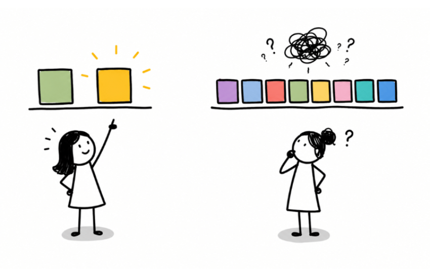
Once users are engaged and got used to the interface, the instinct may be to show them every option and feature possible. We want to give users the full picture, and in all ways this product can serve them.
Renowned American psychologist Barry Schwartz, called it the paradox of choice, and found that this instinct can backfire. More options do not lead to better decisions or higher satisfaction, and instead can lead to decision paralysis, lower confidence in the ultimate choice made, and higher regret. In this case, the cognitive work of evaluating 10 options feels like a burden rather than empowerment.
In usability sessions, users rarely say, “There are too many choices.” Instead, they pause, compare, second-guess, ask what other people usually choose, or abandon the task entirely. Think about the last time you used a streaming service and spent 20 minutes browsing before giving up and watching nothing. Or when you are interested in buying a new smartphone but end up scrolling through the endless list of phone models and eventually closing the website. The content was all there, but the weight of choosing made the decision more overwhelming than it needed to be.
The irony is that the more a product tries to serve every possible need, the less it may serve the person in front of it. Generosity in design can quietly become its own kind of barrier.
When users are overwhelmed, their decision rarely comes from careful thought. This is where the Elaboration Likelihood Model becomes useful, and there are 2 routes:
Central Route
Users carefully evaluate the evidence, weigh the arguments, and form a considered opinion.
Peripheral Route
Faster and more intuitive. Users respond to cues like tone, aesthetics, familiarity, and social signals rather than the content itself.
When users already feel uncertain about their own capability and are overwhelmed by too many options, they retreat even further into the peripheral route. They don’t have the mental bandwidth to evaluate carefully, and goes off whether it feels worth it and whether it feels safe to continue with.
Designing for Trust in Practice
The psychological journey a user takes through a new product looks something like this: they arrive with a quiet question about their own capability, they gauge their expectations against early experiences, they hit the cognitive weight of too many choices, and they make their trust decisions largely on feel rather than careful analysis.
Though it seems like a lot happening, each of these mechanisms point to something specific.
- Build confidence before capability. Onboarding that assumes confidence will only serve users who already have it. Design for the user who arrives uncertain and let them succeed at something small before you show them the full scope of what’s possible.
- Design for recovery, not just performance. Your product will make mistakes. What happens in the moment after is more important for long-term trust than the mistake itself. Acknowledge errors gracefully. Give users agency to correct and override.
- Default to less. The instinct to show users everything works against them. Fewer choices, clearer outputs, and visible reasoning build more trust than comprehensive menus of possibilities.
- Treat your design as a trust system. Designs become the primary currency of trust for users who are processing on gut feel, which is most users, most of the time.
Products change over time, but the way the human mind works is less likely to change.
At Uism, we go beyond reporting what users do. We work alongside you to uncover what sits beneath the surface, and translate it into concrete actions that connect to your business outcomes. If you’re curious about what’s really driving your users’ behavior, we’d love to talk.
References:
- American Psychological Association
- American Psychological Association
- Research Gate
- Schwartz, B. (2005). The paradox of choice: Why more is less. Harper Perennial.
UX Research & Strategy
Learn more about Uism’s UX research services.