


Article Summary
- Localization is not just translation: Good localization is adapting the whole user experience so users can understand, trust, and complete tasks confidently. Successful market entry requires asking whether Japanese users can use the product, not just whether the translation is accurate.
- Japanese-specific handling in UD: UI copy and design must be tested in real interfaces, and plan for text expansion/compression, flexible layouts, readable fonts, and a consistent Japanese terminology list across product and support channels.
- Show Legitimacy through Clarity and Attention to Detail: Surface key details up front, localize legal and support pages, and show clear contact and refund policies. Ensure technical and usability compatibility with local platforms, payment methods, and accessibility for Japanese screen readers and IMEs.
For businesses looking to enter the Japanese market, success requires more than just translating your local text into Japanese and running the same designs. Many overseas companies make this critical mistake, leading to confusing interfaces, lost user trust, and ultimately, failed market entry.
Localization is not translation. It is the deep adaptation of the entire user experience—from text and design to functionality—to meet the cultural and practical expectations of Japanese users. For overseas product teams, the key question is not, “Is the Japanese translation accurate?” but, “Can Japanese users understand, trust, and complete key tasks with confidence?”
This guide introduces practical points to consider when localizing websites, apps, and other digital services for Japan.
Advice for UI Copy and Design
Japanese text has its own logic and flow. A direct one-to-one translation often results in copy that is unnatural, confusing, and apparent to Japanese users that minimal effort was taken in its creation. Consider the following:
Test Japanese UI copy in the real interface
Japanese grammar relies on particles and word order. This means poor or inconsistent line breaks can result in text that is awkward to read or unnatural. Automated line breaks from responsive design can create needless errors when displayed across different interfaces or devices. Even if the user understands the meaning, the product feels unfinished.
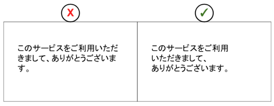
Practical decision point
Review Japanese copy it in the actual UI, across real screen sizes, not only in a translation file.
Before launch, check:
- mobile and desktop layouts
- buttons, menus, cards, and modals
- error messages and system notifications
- places where text wraps automatically
- long labels, short labels, and dynamic content
When necessary, adjust the UI layout rather than forcing Japanese copy to fit an English-first design.
Use Japanese terms users already expect
The Japanese writing system utilizes multiple writing systems, hiragana, katakana, kanji, and occasionally the Latin alphabet. Furthermore, a number of loanwords (called 外来語 or gairaigo) from English and other languages have become commonplace in Japanese digital products and spaces. Due to the overlap in meaning of borrowed words versus a Japanese alternative, the question to be answered when choosing terms is “What do users in Japan already expect in this context?”. In some instances, the loanword may feel natural while a literal Japanese translation is overly formal or unusual. In other cases, a direct loanword may only be familiar to the internal team.
| Common Words as Gairaigo | Common Translated Words |
|---|---|
|
|
Practical decision point
Create a Japanese terminology list for your product.
For each key term, decide:
- Is there an established Japanese UI term?
- Is the katakana term already common in this product category?
- Would a Japanese phrase be clearer than a loanword?
- Do users need a short explanation the first time the term appears?
- Are the same terms used consistently across the product, support pages, emails, and marketing pages?
This is especially important for products with specialized features, subscription plans, dashboards, AI functions, financial information, or healthcare-related content.
Consider alternative structures with user-addressed copy
English UI copy often addresses the user directly with an explicit “you” (e.g “You can edit your profile”), but Japanese UI copy often omits the subject and usually sounds more natural when it focuses on the action or destination . Overly literal translations can feel awkward, even when the meaning is correct. For example, instead of “You can change your settings here,” a more natural phrasing would be 「設定はこちらから変更できます」 (Settei wa kochira kara henkou dekimasu), which directly translates to “Settings can be changed from here.”
This does not mean Japanese copy should always be indirect or passive. Clear action labels are still important. But the sentence structure often needs to be rewritten, not simply translated.
Practical decision point
When reviewing Japanese UI copy, ask:
- Does the copy sound like natural Japanese product language?
- Is it clear what action the user can take?
- Does it sound too literal, too formal, or too pushy?
Is the tone appropriate for the product category? ashboards, AI functions, financial information, or healthcare-related content.
Design for Japanese character count and spacing
Japanese text behaves differently from English in a UI. A 10-character English word will not translate to a 10-character Japanese word. Japanese is often more compact than English (quick comparison: JAPANESE (8) vs. 日本語 (3)), it does not automatically mean it takes less space or is easier to fit in a UI. Most Japanese characters would be written at the size of a capital letter, known as “full-width.” Keep in mind spatial limitations so no information or visual clarity is lost, especially in limited fields like buttons and icons.
Practical decision point
Plan for Japanese text expansion and compression from the beginning.
Useful practices include:
- Testing real Japanese strings, not placeholder text
- Allowing flexible button widths where possible
- Avoiding overly narrow components
- Checking vertical space on mobile
- Reviewing truncation rules
- Avoiding half-width katakana unless there is a specific reason
- Confirming that fonts display Japanese characters cleanly
Japanese localization is not only a copywriting task. It is also a UI design task.
Advice for Instilling Trust in the Service
Trust is part of UX. It should not be treated as a legal afterthought but as vital to the long-term image and success of a brand. Localizing for Japan includes presenting company and service details in a way that aligns with Japanese expectations and meet their need to validate legitimacy.
Provide key information up front for confident action
While Western design trends often favor minimalism and hiding information behind clicks, depending on the category, Japanese users may expect key details, options, and specifications to be clearly displayed as early as possible so they can make an informed decision without having to hunt for information. This is not about creating clutter; it is about providing comprehensive information to a risk-averse user so they can have enough confidence to make an informed decision. See our previous article looking at Japanese usage of space in web design for more details on digital aesthetics.
Practical decision point
For key conversion pages, decide what users need to know before they can confidently proceed.
Do not simply copy the information architecture from your home market. Instead, review whether Japanese users can easily answer questions such as:
- What exactly am I signing up for?
- What will it cost?
- Can I cancel?
- Is this company reliable?
- What happens after I click this button?
- Who can I contact if something goes wrong?
Build Trust and Trustworthiness
For Japanese consumers, trusting the company behind the product is paramount. A faceless website or app will be abandoned quickly. Trust is important in any market, but it becomes critical with an unfamiliar, overseas-based company that is expected to handle a user’s personal information or have access to their finances.
Basic trust signals include:
- clear company information
- Japanese-language support information
- contact options
- privacy policy and security explanations
- terms of service
- refund or cancellation information
- commercial transaction information where relevant
Practical decision point
Audit your product from the perspective of a cautious first-time user.
Ask:
- Can users quickly understand who operates the service?
- Can they find help before and after purchase?
- Are legal and policy pages localized, not just machine-translated?
- Are cancellation, refund, and data-use policies understandable?
- Does the service feel prepared for Japanese users, or merely translated into Japanese?
Advice for Usability
Localization is not just what appears on the screen but properly taking local digital habits and tools into consideration. Ensuring an interface is compatible with parts such as Japanese payment methods, input methods, and assistive tech will help minimize friction with adoption in the new market.
Adapt to local platforms and payment methods
Forcing Japanese users onto Western-centric platforms is a potential gap in localization. Proper localization includes designing compatibility with the user’s existing digital environment. Integrate with the services they already use daily.
Here are some common social platforms and payment options in Japan to consider:
Social Platforms
LINE
The dominant communication app in Japan, with many services designed around integration or communication via the app.
-9.png)
Payment Option 1:
Convenience Store
(コンビニ払い, Konbini Barai)
-8.png)
Payment Option 2:
Bank Transfer
(銀行振込, Ginkou Furikomi)
-7.png)
Payment Option 3:
Mobile Payments
(e.g., like PayPay)
Localize forms and input fields for the Japanese context
Forms are one of the clearest places where poor localization becomes visible.
A product may look polished, but if the registration or checkout form assumes a Western name and address structure, users immediately notice that the product was not designed for Japan.
Forms should be redesigned for:
- Name Fields: Provide separate fields for Last Name (姓) and First Name (名). Crucially, include Furigana fields—phonetic spellings of the names in katakana or hiragana—as many names have multiple possible readings.
- Address Fields: The Japanese address format is the opposite of the West’s, starting with the largest unit (prefecture) and ending with the smallest (apartment number). A field would best have a dropdown for the 47 prefectures and follow the standard sequence: Prefecture -> City/Municipality -> District/Street -> Building/Apartment Number. Additionally, postal codes are 7 numbers written as ###-####.
- Various Writing Systems: Japanese names and addresses utilize a combination of all 3 Japanese writing systems as well as the latin alphabet. Ensure validation rules do not reject any input or mixed input within one field.
Check accessibility and technical compatibility in a Japanese context
Accessibility and compatibility with adaptive tools should also be considered in localization. Japanese content can create specific issues for screen readers, language settings, fonts, reading order, and form input.
Important checks to include:
- Ensure correct language attribute (lang=”ja”) on pages to trigger Japanese text-to-speech and IME behavior.
- Test screen readers (VoiceOver, TalkBack) with Japanese content; confirm reading order and particle separation remain coherent.
- Provide clear focus states and large tap targets for various screen sizes.
- Ensure font supports full-width glyphs and furigana (readings from kanji).
- Test on common Japanese operating systems and lower bandwidth profiles; optimize for images and font loading (subset fonts where possible).
- Use font-display: swap and provide robust fallback fonts that support Japanese glyphs to avoid invisible text.
When in Doubt, Validate with Real Users
Many localization issues are not obvious until observed by real users. Testing key flows with 5-10 local users can give quick, reliable insights that internal discussions may leave untouched.
Validation testing is especially recommended when:
- There are multiple “correct” options for phrasing
- An internal conclusion can’t be reached on the right phrasing or flow
- Conversion is lower than expected
Conclusion: An Investment, Not a Cost
Successfully entering the Japanese market requires a genuine commitment to understanding and respecting your users. Viewing localization as a deep, holistic process of adaptation—rather than a simple translation task—is the first and most important step.
Partner with native Japanese copywriters, designers, and researchers early in the process. Their expertise is an investment that will pay dividends in user adoption, loyalty, and long-term success. If you’re looking for a trusted partner to assist you in your localization and smooth launch in Japan, feel free to contact us.
UX Research & Strategy
Learn more about Uism’s UX research services.